
Description
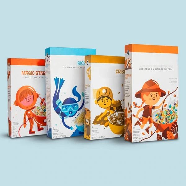
Colorful Cereal Boxes with a Clear Visual Direction
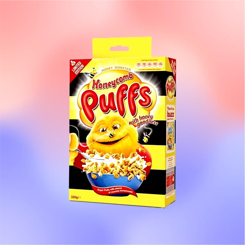
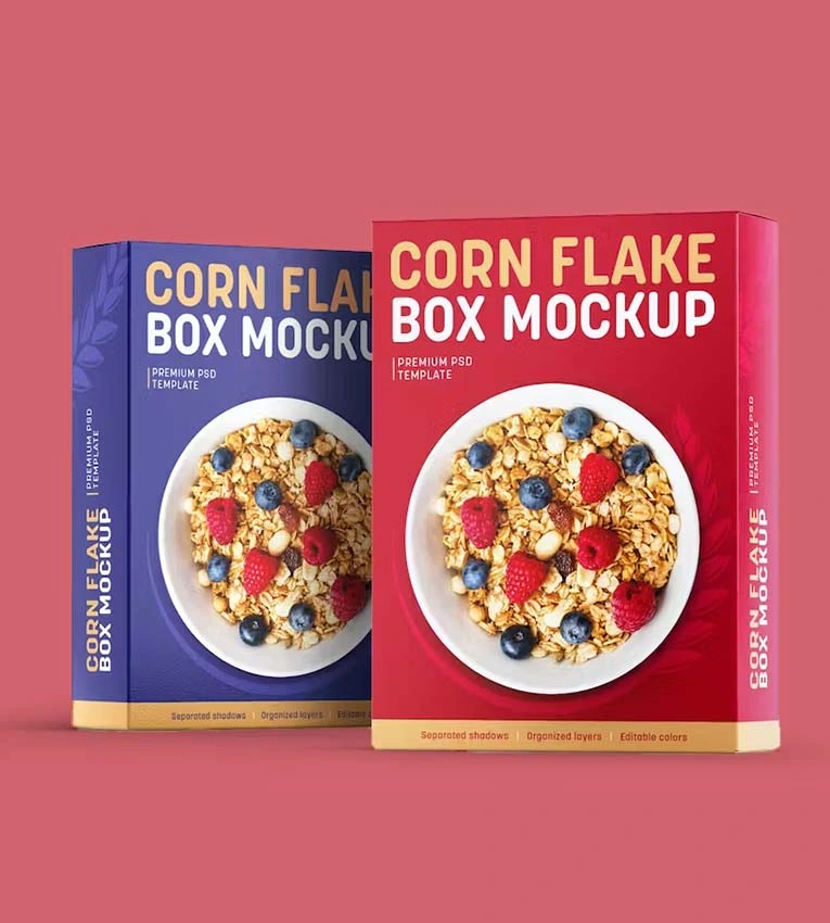
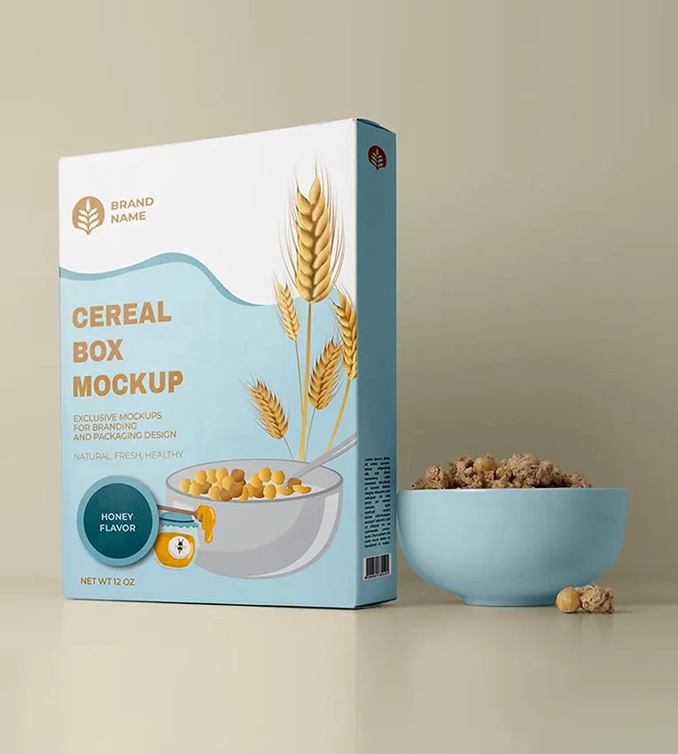
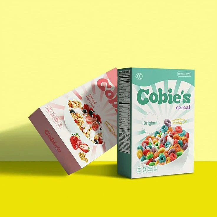
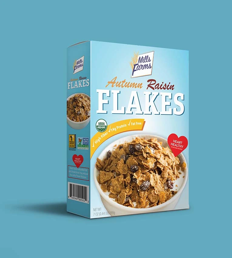
Colorful cereal boxes work best when the palette helps customers recognize the brand and distinguish the product. Strong graphics should support the cereal name and variety rather than make them difficult to find.
At Now Custom Boxes, we develop printed cartons around your artwork, selected stock, and packed dimensions. The design can use bold illustrations, restrained color blocks, or a combination suited to your brand.
For a broader comparison of carton formats, explore our custom cereal packaging collection.
Choose Colors That Organize Your Flavor Range
A coordinated palette can connect several cereal varieties while giving each one a recognizable identity. Keep the main logo, typography, and product-name position consistent, then change selected colors or illustrations between flavors.
Use written variety names alongside color cues. Customers should not have to identify a product by color alone, particularly when two designs use similar shades.
For a mixed range, prepare a reference showing every front panel together. This makes it easier to check whether the designs look related while remaining distinct.
Compare CMYK and PMS Printing Requirements
CMYK process printing can reproduce full-color illustrations, photographs, and many combinations of color. PMS spot colors can be discussed when a specified brand color needs particular attention.
Not every bright screen color can be reproduced exactly in standard process printing. Identify color-critical elements early and ask which print specification suits them.
Our custom box printing services can support the artwork review. Confirm the chosen color approach before approving production files rather than relying only on how a design appears on your monitor.
The Paperboard Surface Changes the Printed Appearance
White paperboard and brown kraft provide different backgrounds for the same artwork. Pale colors and subtle details may look less distinct on brown stock, while a white surface offers a different starting point for a bright palette.
The board surface and selected finish also influence the final appearance. Review the actual stock specification alongside your design rather than treating the material as a separate decision.
If you have an existing printed carton you want to match, provide a physical reference. Explain which colors matter most and agree on the approval method before production.
Keep the Front Panel Easy to Read
A colorful design still needs a clear order of information. Establish where the brand, cereal variety, and pack size will sit before adding supporting graphics.
Check contrast between lettering and the background. Fine text over a detailed illustration can become difficult to read even when the overall design looks attractive at a larger size.
Review the front panel at its final dimensions. Artwork that works well on a large screen may need adjustment when viewed as an assembled carton on a shelf.
Give Product Information Its Own Space
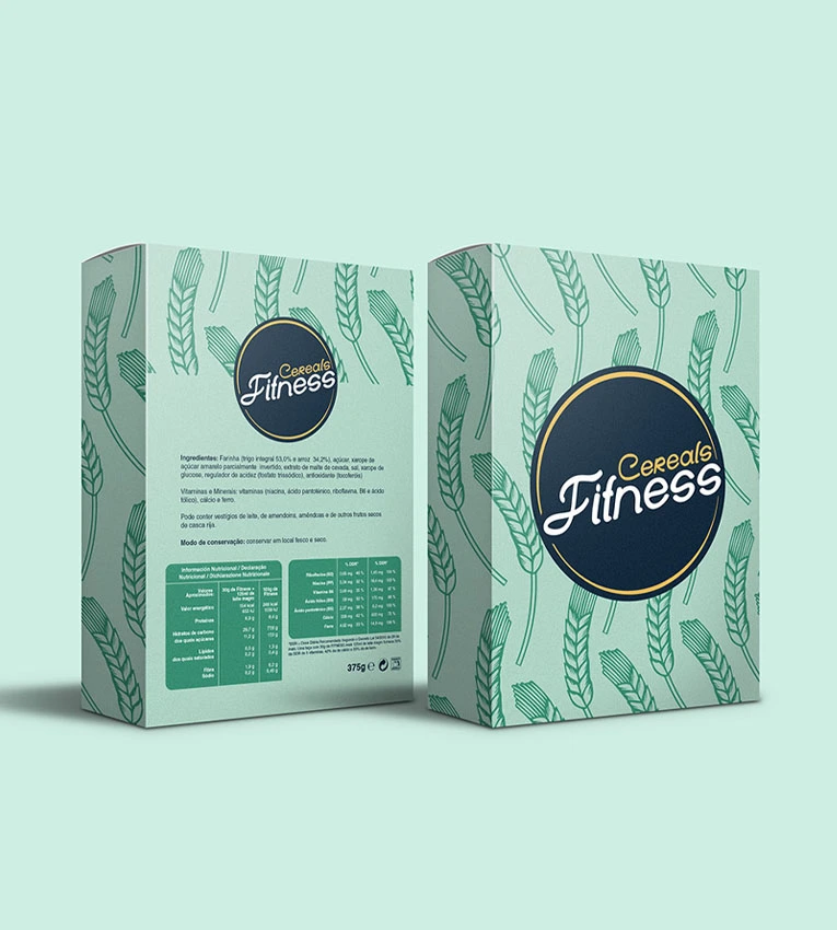
Reserve suitable panels for your approved product details and barcode requirements. Decorative graphics should not force essential information into cramped areas near folds or seams.
Keep information panels visually distinct from busy artwork where practical. Use the final approved wording and confirm its layout against the production cutting template.
The carton should communicate the product accurately. Color choices and illustrations should not imply ingredients, certifications, or benefits that the product does not support.
Adapt the Artwork to Each Carton Size
A larger retail carton and a compact sample pack need different layouts. Simply shrinking the design can make product names, supporting text, and illustrations difficult to read.
For smaller formats, review our mini cereal boxes. Retain recognizable brand elements while adjusting the hierarchy and level of detail to the available space.
If the project also needs an unusual profile or opening, explore our unique cereal boxes and confirm the structure before final artwork placement.
Select Finishes That Support the Palette
Matte and gloss treatments create different surface appearances. Spot UV can emphasize selected areas, while foil or embossing may highlight a logo or another focal point.
Discuss suitability for the selected board and artwork. A decorative effect should complement the color scheme without reducing readability or making the design harder to assess.
Confirm which finish will be represented in the proof or sample. The appearance of uncoated artwork should not be assumed to match a finished production carton.
Set Carton Dimensions Around the Filled Inner Package
The printed design needs an approved structure to work on. Measure the filled and sealed cereal pouch, including its widest profile and the space occupied by folded seals.
Different cereal shapes and densities can require different volumes at the same weight. Share packed measurements rather than choosing dimensions from net weight alone.
The outer carton provides structure and printed presentation. Any food-contact or barrier requirements for the inner package should be specified separately.
Prepare Files for Every Artwork Version
Use the approved dieline for each carton size and keep artwork versions clearly identified. Provide the required quantity for every flavor or edition.
Follow the supplied requirements for bleed, safe areas, image quality, and fonts. Keep critical text clear of cut lines, folds, glue areas, and closures.
Review names, variant colors, barcodes, and other changing details across the complete set. A consistent master layout is useful, but each production file still needs its own check.
Use Proofs to Agree on the Expected Result
A digital proof helps review layout, spelling, and artwork placement. It should not be treated as a guaranteed match to the final printed color.
For color-critical work, ask which physical proof or printed sample options are available and what production characteristics they represent. Confirm the stock and finishing before approval.
Keep the approved reference for future runs. If the material, finish, or print specification changes, review the expected appearance again rather than assuming the previous result will remain identical.
Quote Colorful Cereal Boxes by Design and Quantity
Pricing depends on carton dimensions, material, color specification, finishes, and order quantity. Provide the quantity per artwork version as well as the combined total.
If several flavors share a structure, identify that clearly. If they use different sizes, provide separate specifications and filled-pouch measurements.
Send your artwork, preferred stock, color references, and US delivery ZIP code to quote@nowcustomboxes.com to request pricing and discuss proof options.
Frequently Asked Questions About Colorful Cereal Boxes
Can each cereal flavor have a different color scheme?
Yes. Separate artwork versions can use different colors while retaining the same brand layout. Provide the quantity needed for each design.
Will the printed colors match my screen?
Screen appearance is not a reliable guarantee of printed color. Discuss stock, print specification, and suitable proof options before approval.
Can I specify a PMS brand color?
PMS options are listed on the current page. Confirm suitability and pricing for the particular stock and design.
Can the same artwork be used on mini and larger boxes?
It can be adapted, but each size needs a layout review. Shrinking the full design may make smaller text and details unreadable.
Do colorful finishes keep cereal fresh?
No. Decorative printing and finishes do not establish the complete barrier performance required for the cereal.
What is the minimum order quantity?
The current page lists a minimum of 50 boxes. Confirm the minimum for the selected stock, finishes, and number of artwork versions.
Can I request a printed sample?
Physical sampling is listed as available on request. Confirm what the sample represents, its cost, and timing before ordering.


Reviews
There are no reviews yet.